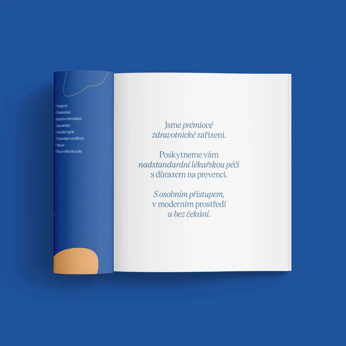
Health+ is a private health clinic that provides top-notch health care to adults, children, and businesses. It relies on thorough prevention, sufficient time for examination, providing almost all care in one place, and using the latest technology.
The client wanted their presentation to correspond to the premium service it offers. At the same time, their wish was that the H+ brand be more attractive to the public while still remaining serious.


In the beginning, we revised the original strategy and developed new communication of services and USP. The original name of "Program Health Plus" was shortened to “Health+”, and abbreviated to “H+”.
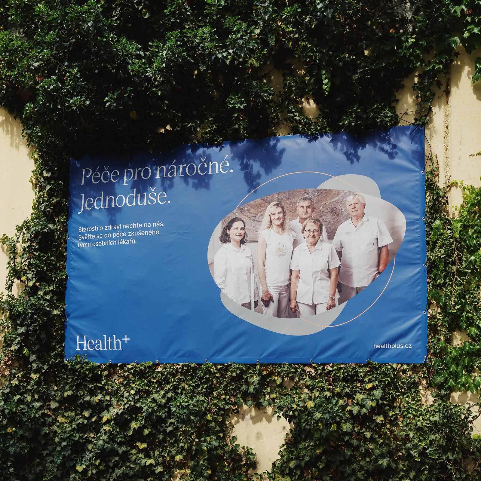
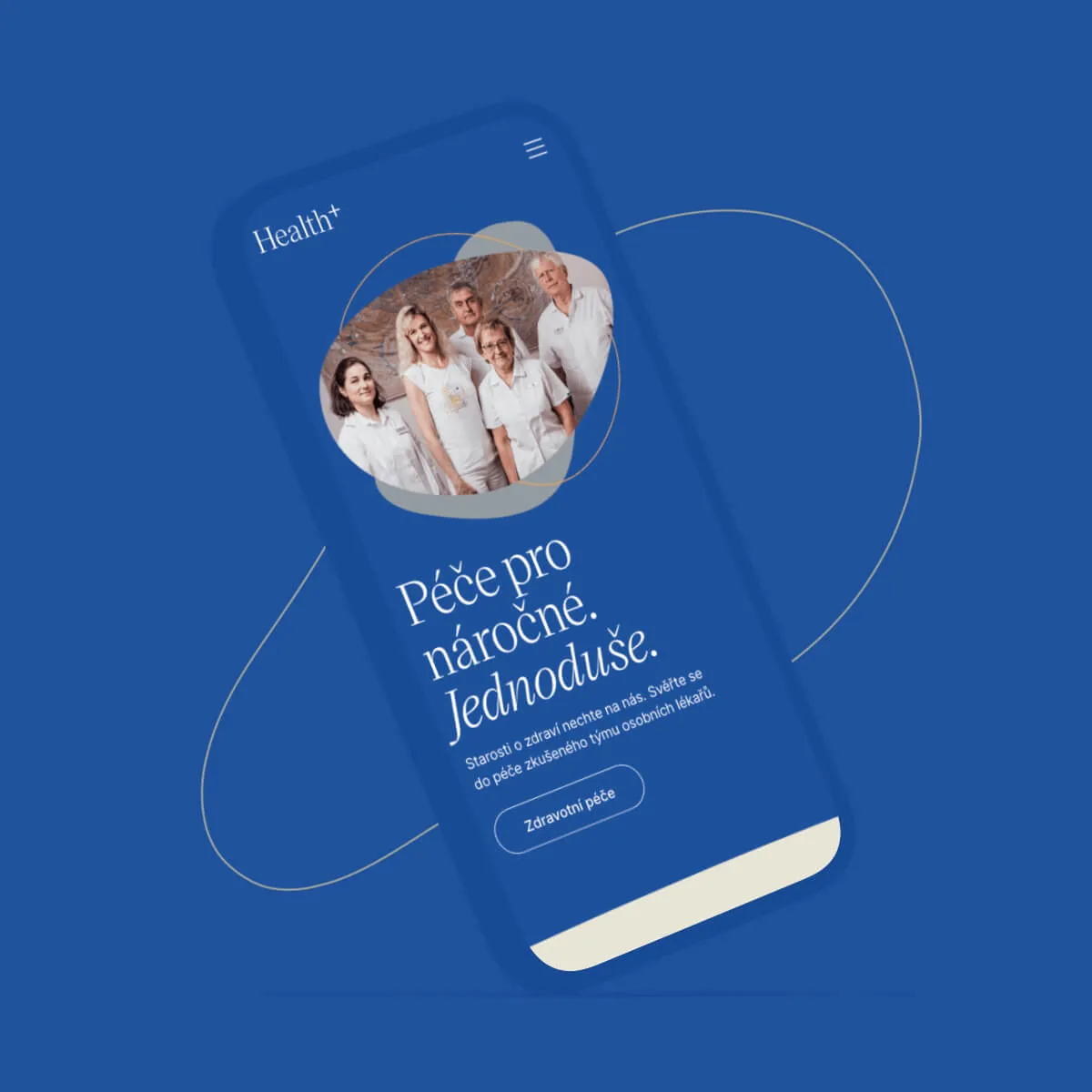
H+ is there for the most demanding and always tries to adapt to them in all respects. We translated this into a new slogan: “Health care for the demanding. Done simply.”
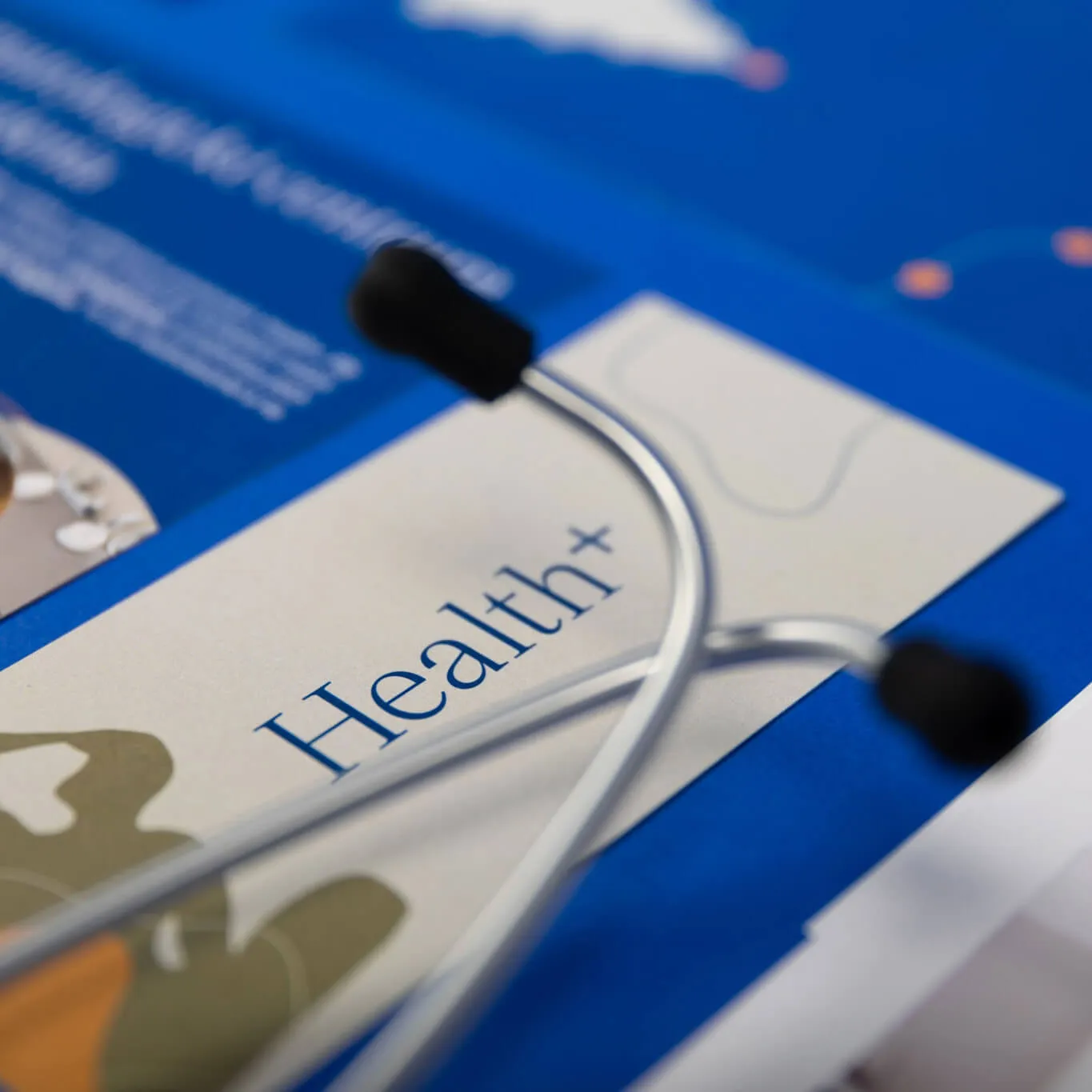
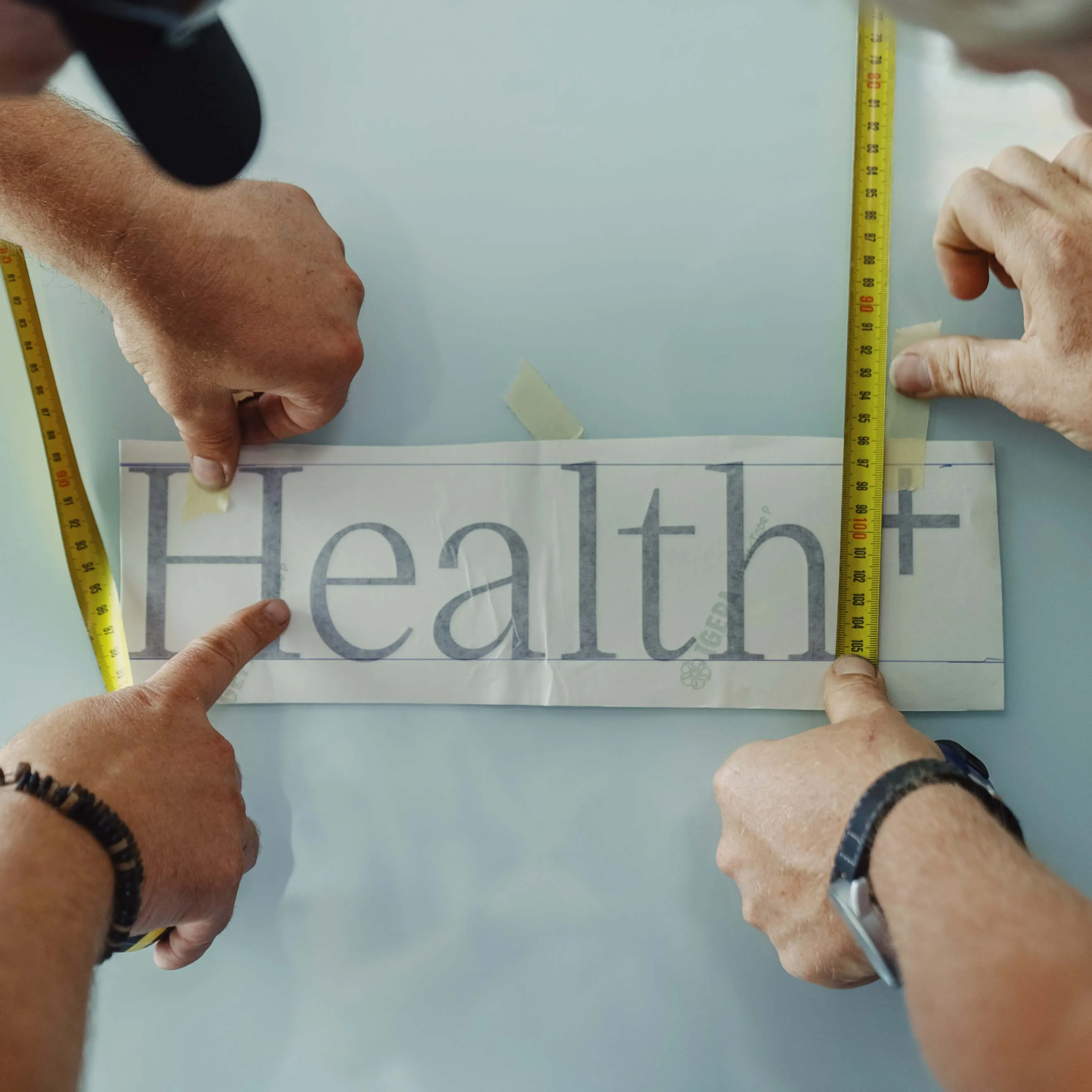
We created a logo with a confident Czech serif font. We made the plus superscript, which refers to premium and superior care.
Creating a minimalist logo may seem like a simple task, but we went through thorough sketching and almost 200 iterations.
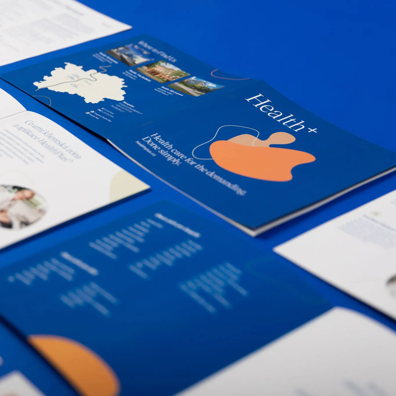
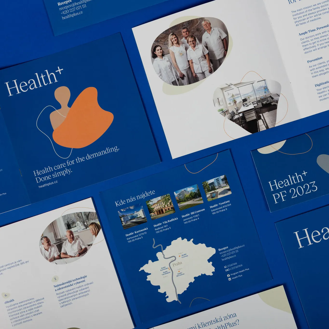
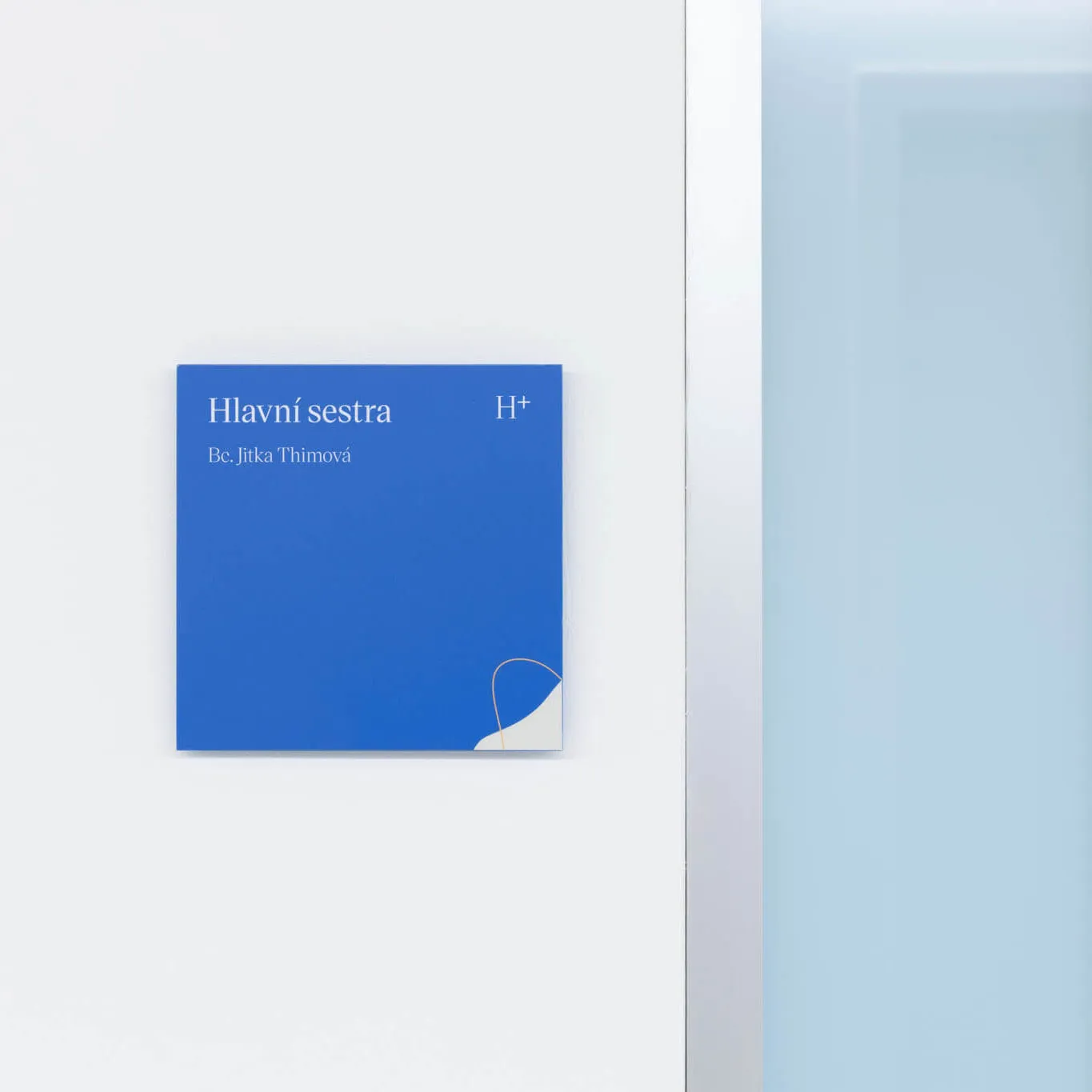
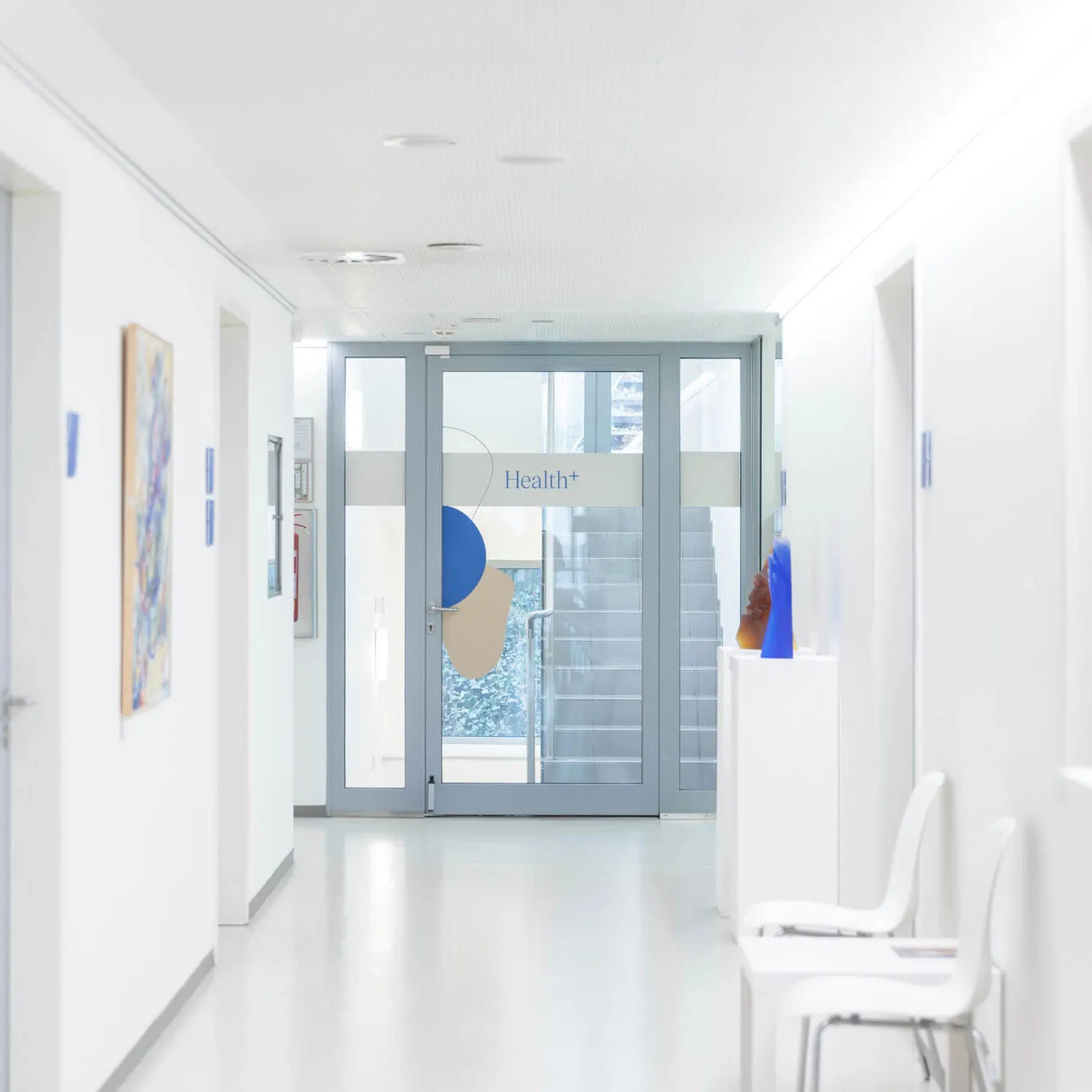
For H+, we chose a dominant dark blue and enriched it with complementary colors. We designed key visuals based on the stylization of figures and shapes inspired by 20th-century art.
These are enriched by abstract shapes in full color or in outline throughout, with which we could further identity.
“With our new identity, we aimed to convey the atmosphere that people experience when they walk through our doors. This was difficult to achieve before the rebranding. The Semibold team was willing to spend time with us to truly understand our brand. Thanks to that, they helped us define who we are, what we want, and what our long-term goals are. In the end, we managed to create a brand that not only looks great but also resonates with our customers.”


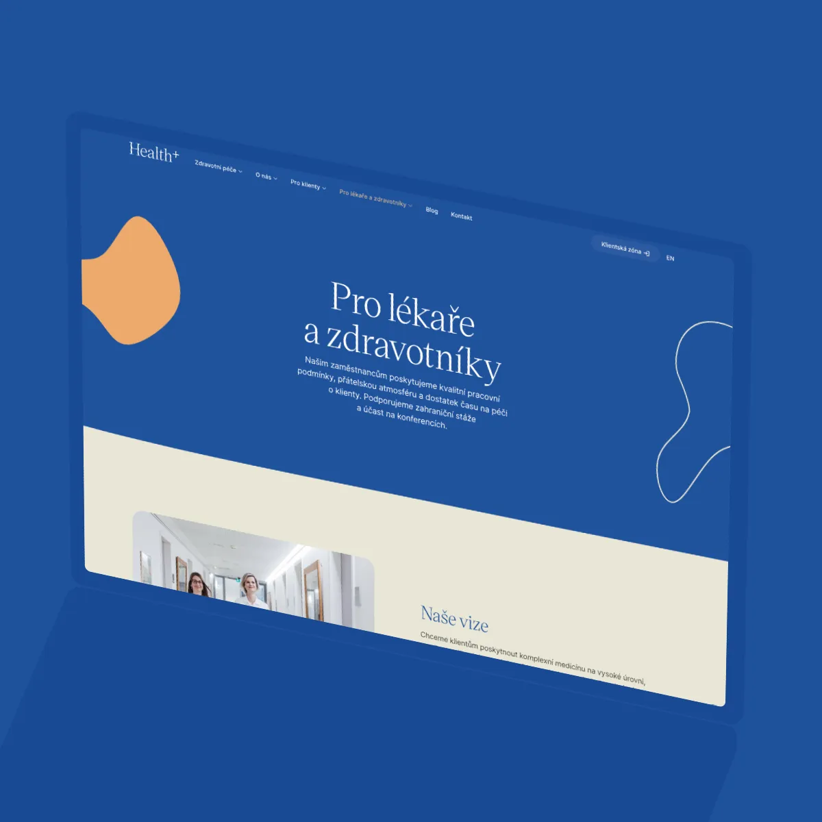
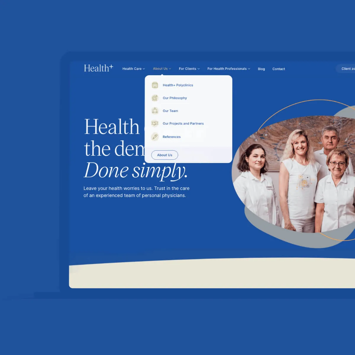
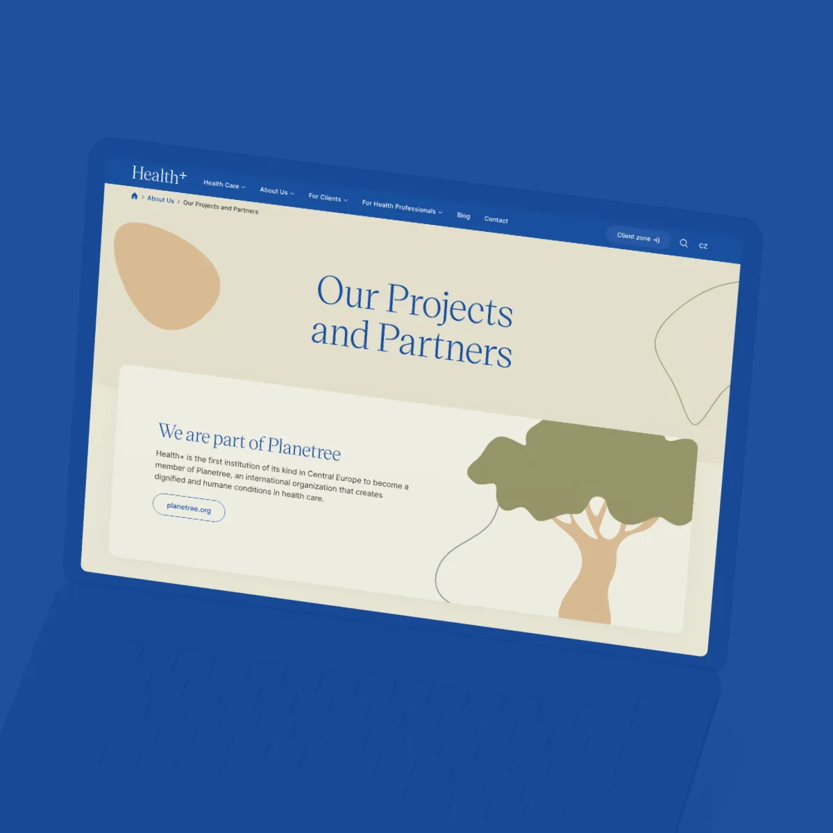
We expanded and completely retexted the original site. SEO expert Šárka Jakubcová developed an analysis that for us was the basis for changes in both structure and content.
Due to the size of the project, we created a design system at the very beginning. Thanks to this, we could simply add sections or pages that we did not initially count on in the structure.
We translated the finished website into English and had it proofread by a native speaker.
Thanks to an intuitive editorial system and our training, the H+ marketing team can manage much of the content on their own.
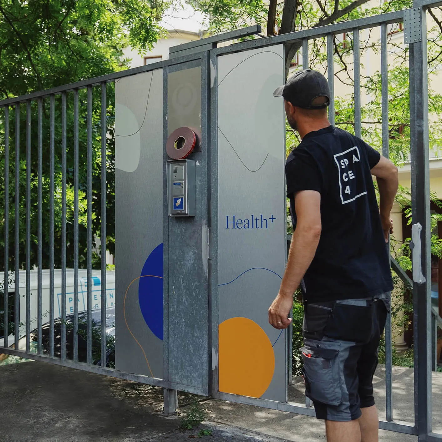
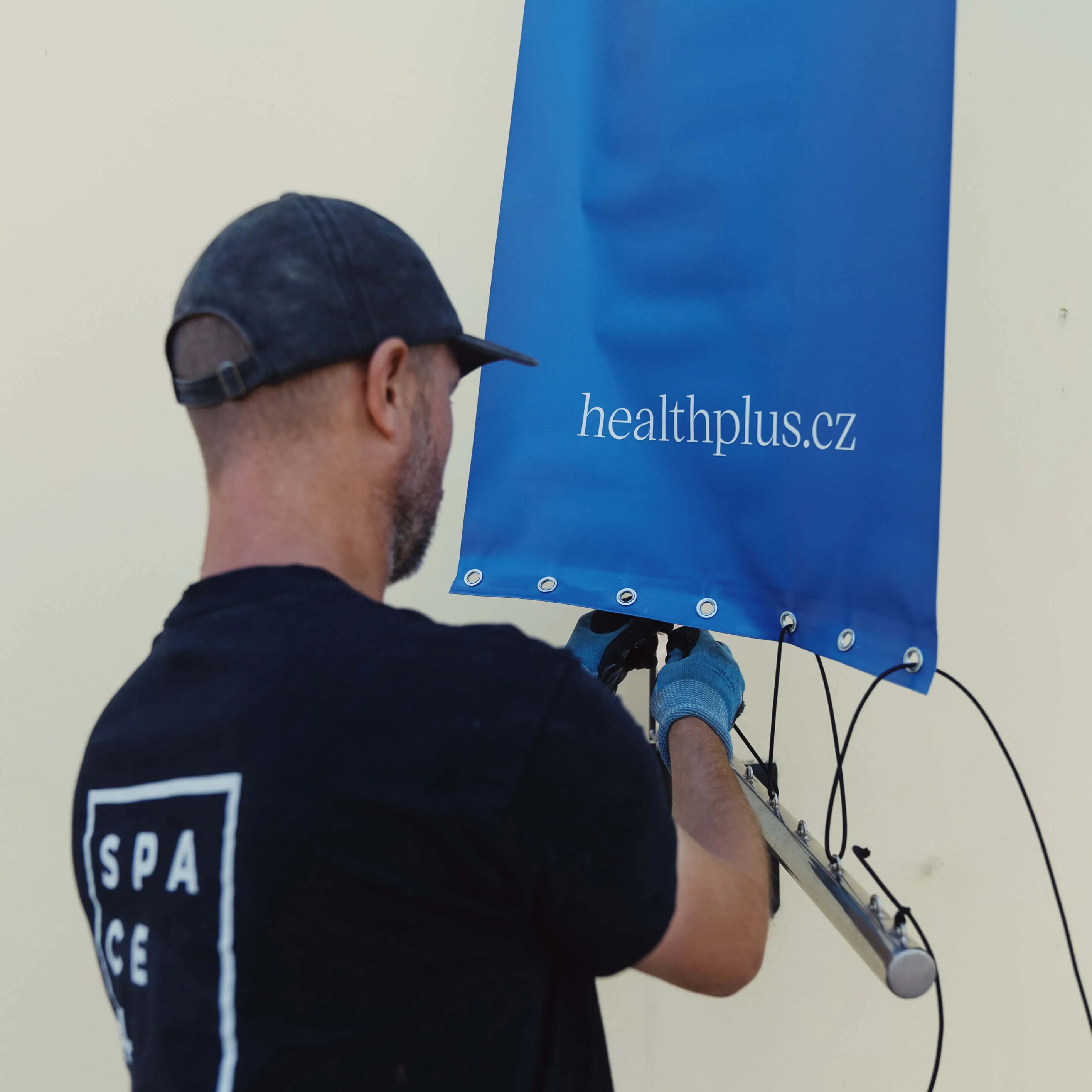
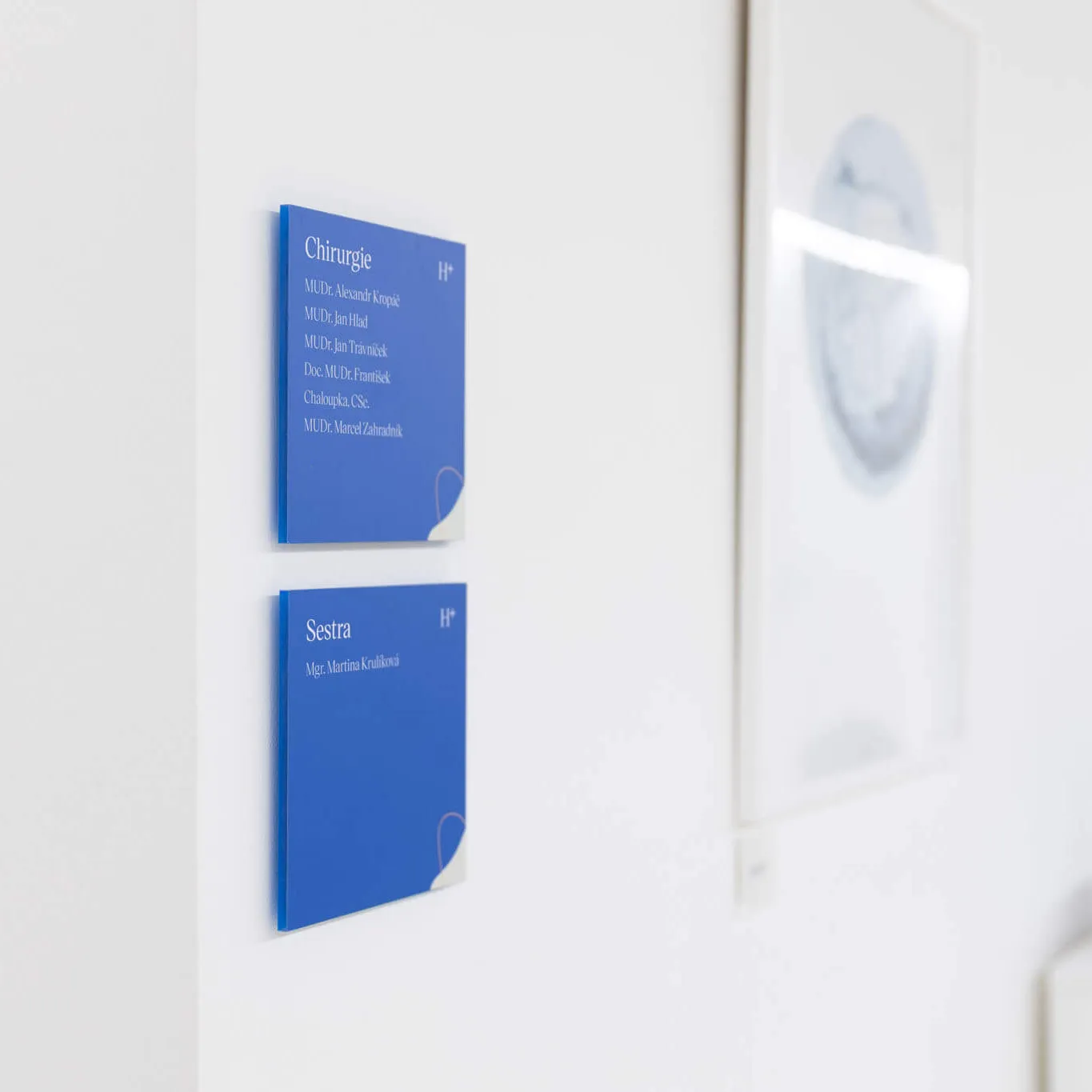
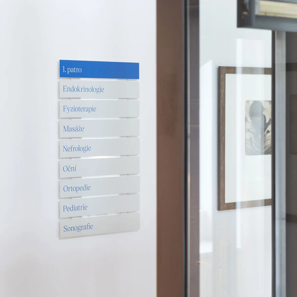
In addition to a lot of communication and printing materials, we also assisted with the interiors and exteriors of the polyclinic. We invited a company, Space4, to work on them, and together with us reimagined the orientation of the premises and use of appropriate materials.
Today you can encounter the identity we created not only within the polyclinic but also by simply strolling through Prague's Smíchov.
We are pleased to have been able to participate in such a complex project as the rebranding of Health+. We accompanied the client along the whole journey — from the foundations to the final touchpoint. Because of this, we were able to offer the full spectrum of our services, which we see as the sweet spot of our work.
We wish Health+ a lot of health for years to come!
“Semibold continues to produce additional materials for us, such as promotional flyers, brochures for clients and employees, visuals for new products, maps to help our clients navigate easily, and many other essentials necessary for the operation of the polyclinic. Another plus was the efficient training in Webflow, which has enabled our team to completely manage the new website content on their own.
We have also opened another branch, where Semibold successfully incorporated the established brand identity.”