After approximately two years of successful operation, it became evident that the Near & Dear Group was outgrowing its original identity, which was crafted when it was founded.
Since then, the group has split into two parts (Communications and Ventures), welcomed numerous new colleagues, and birthed additional companies. Moreover, we all relocated to new offices.
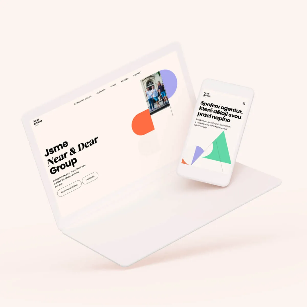
The group needed to adequately speak to its size and clients. Consequently, we decided to create a more conservative yet versatile identity.
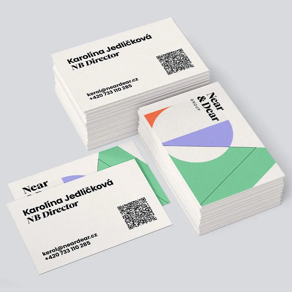
In the initial phase, we updated the existing strategy, and in crafting the new visual identity, almost nothing remained the same except for the logo.
However, we retained the original idea of intertwining colors, symbolizing collaboration, connection, and the collective growth of the companies within the group.
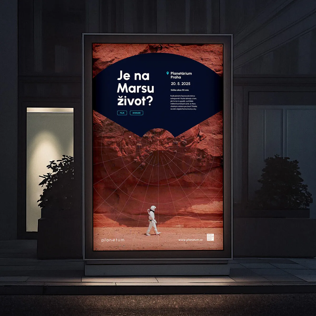
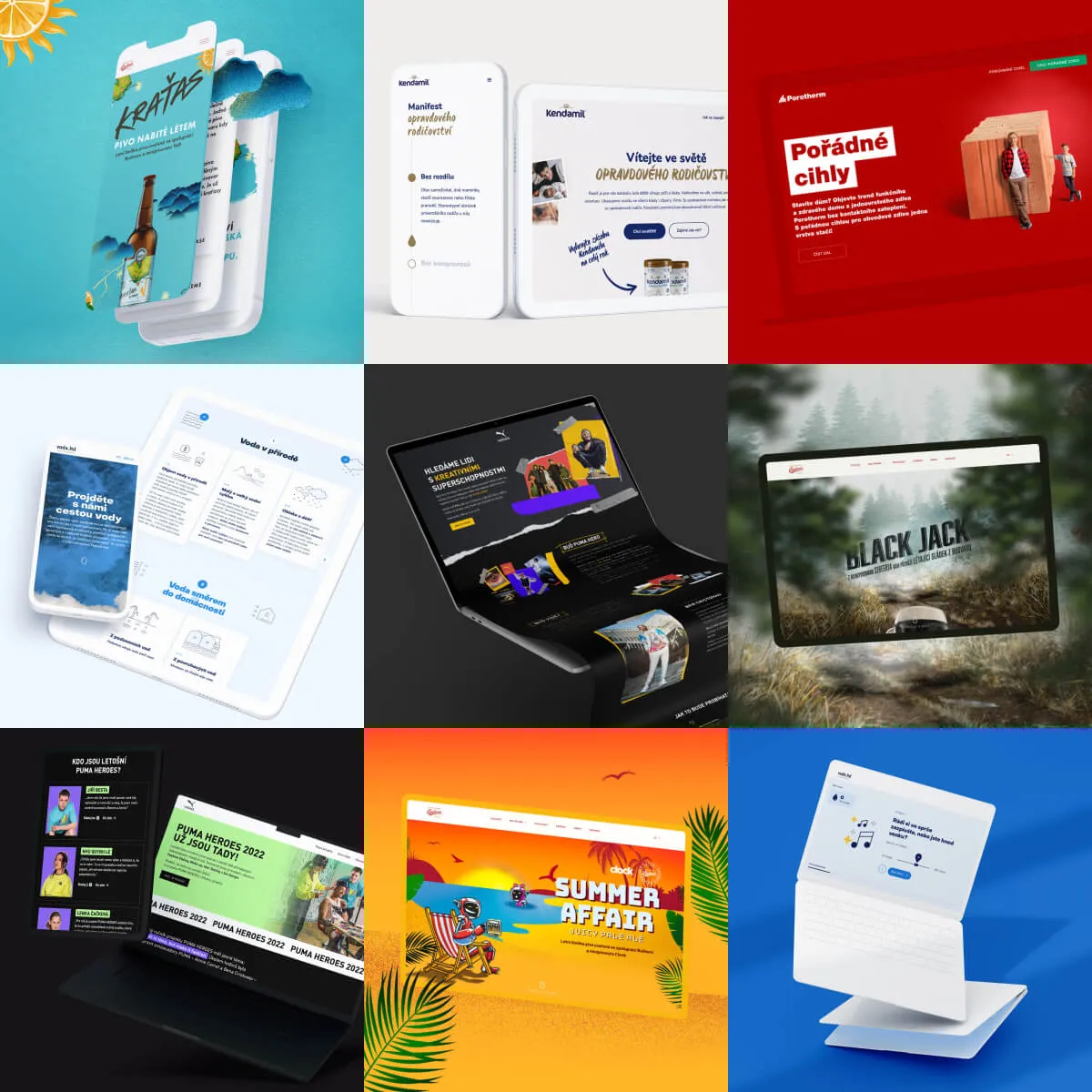
We introduced calmer color combinations, applied within clear geometric shapes that interact with one another. We modernized font usage and expanded the spectrum of supplementary visuals.
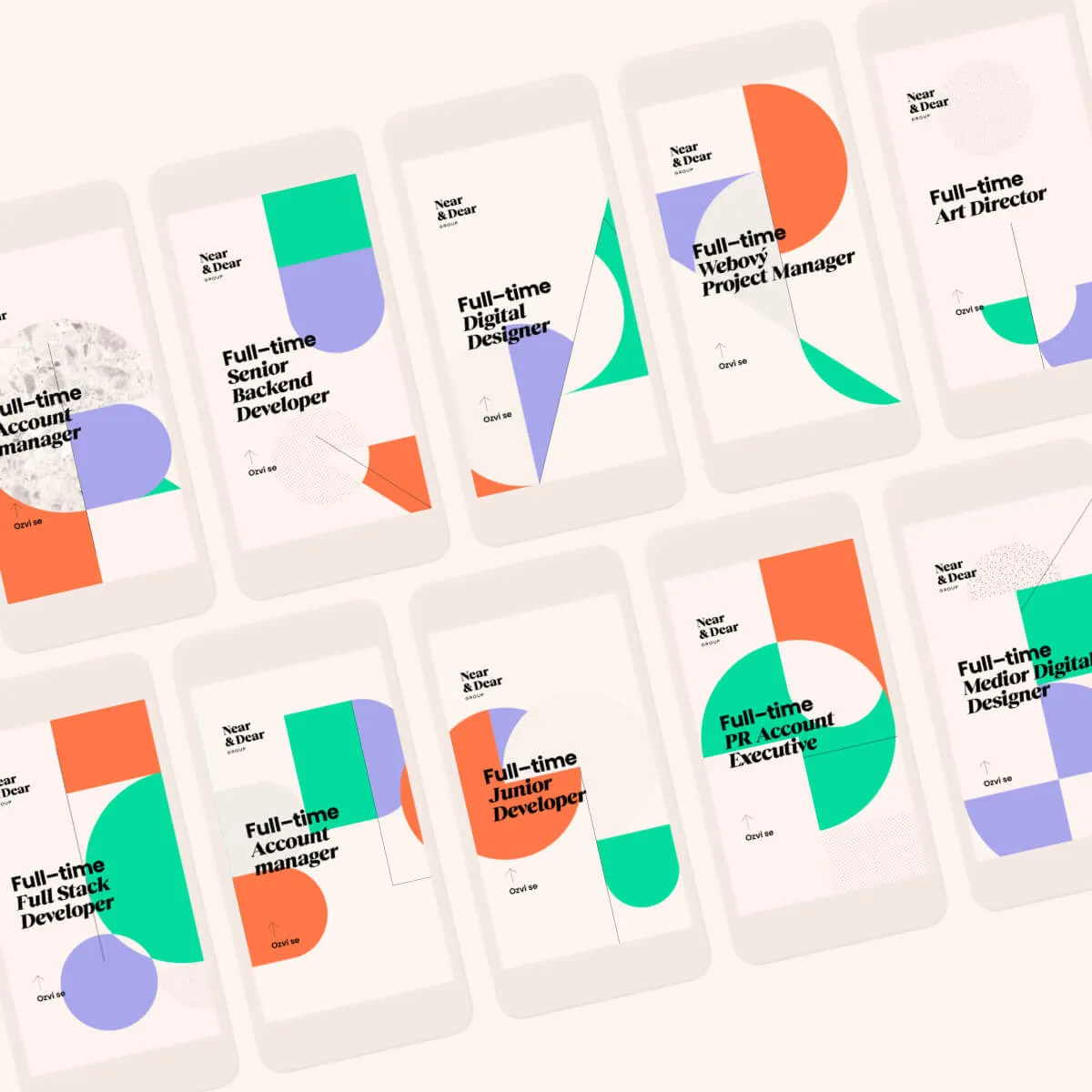
To achieve infinite variability in visuals and save people the effort of content creation, we employed automation.
In collaboration with the Department of Visual Computing at Masaryk University, we developed a generator capable of creating an infinite array of compositional variations based on programmed rules. The author of a social media post only needs to add the text.
You can try it for yourself – simply click on the image.


Even the original web presentation of Near & Dear was created on our favorite platform, Webflow. This meant that during the redesign, we didn't have to start from scratch, saving us hours of work. While we modified the structure and style, we could build upon the original framework.
We incorporated interactive animations to enliven the identity on the website, all while remaining subtle enough to keep the content in the spotlight.
A pivotal step was the better description of Near & Dear’s story and values. Another significant addition is the careers section, now used by all the companies within the group. However, the highlight is that the HR team manages it themselves. This eliminates the need to involve any additional personnel, making position updates convenient and swift.
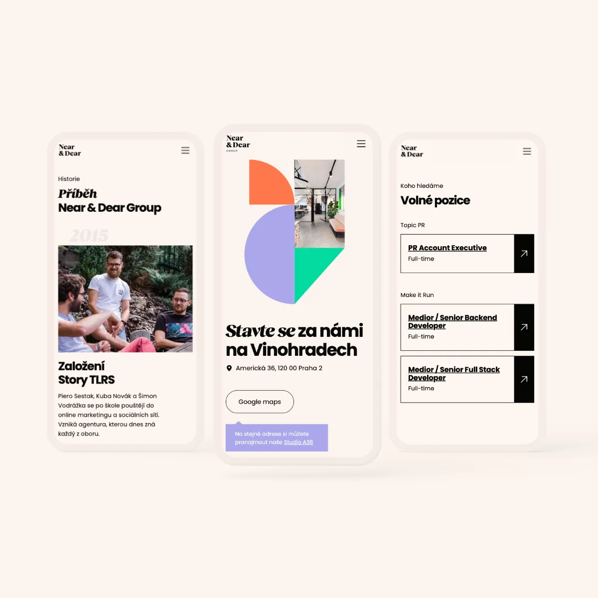
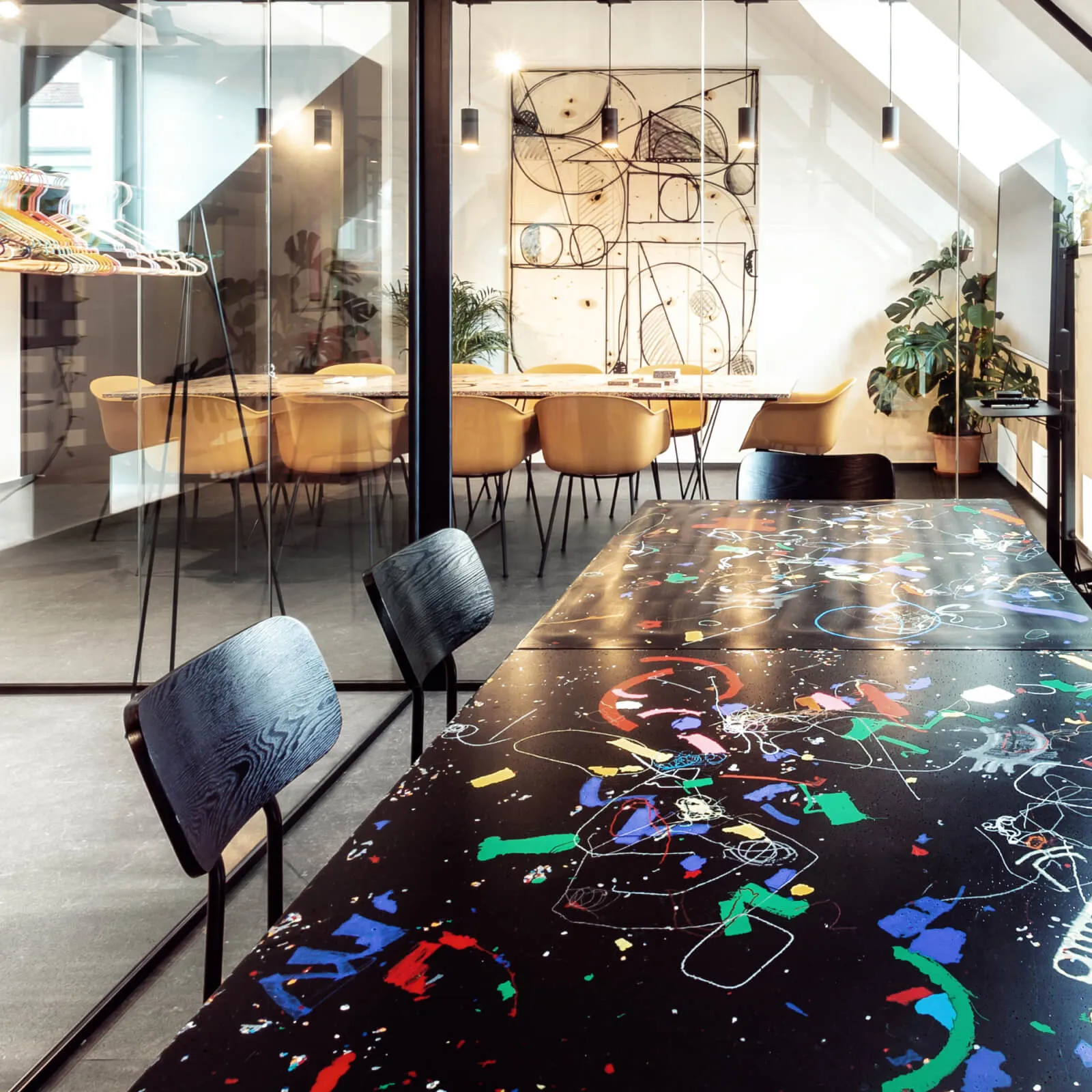
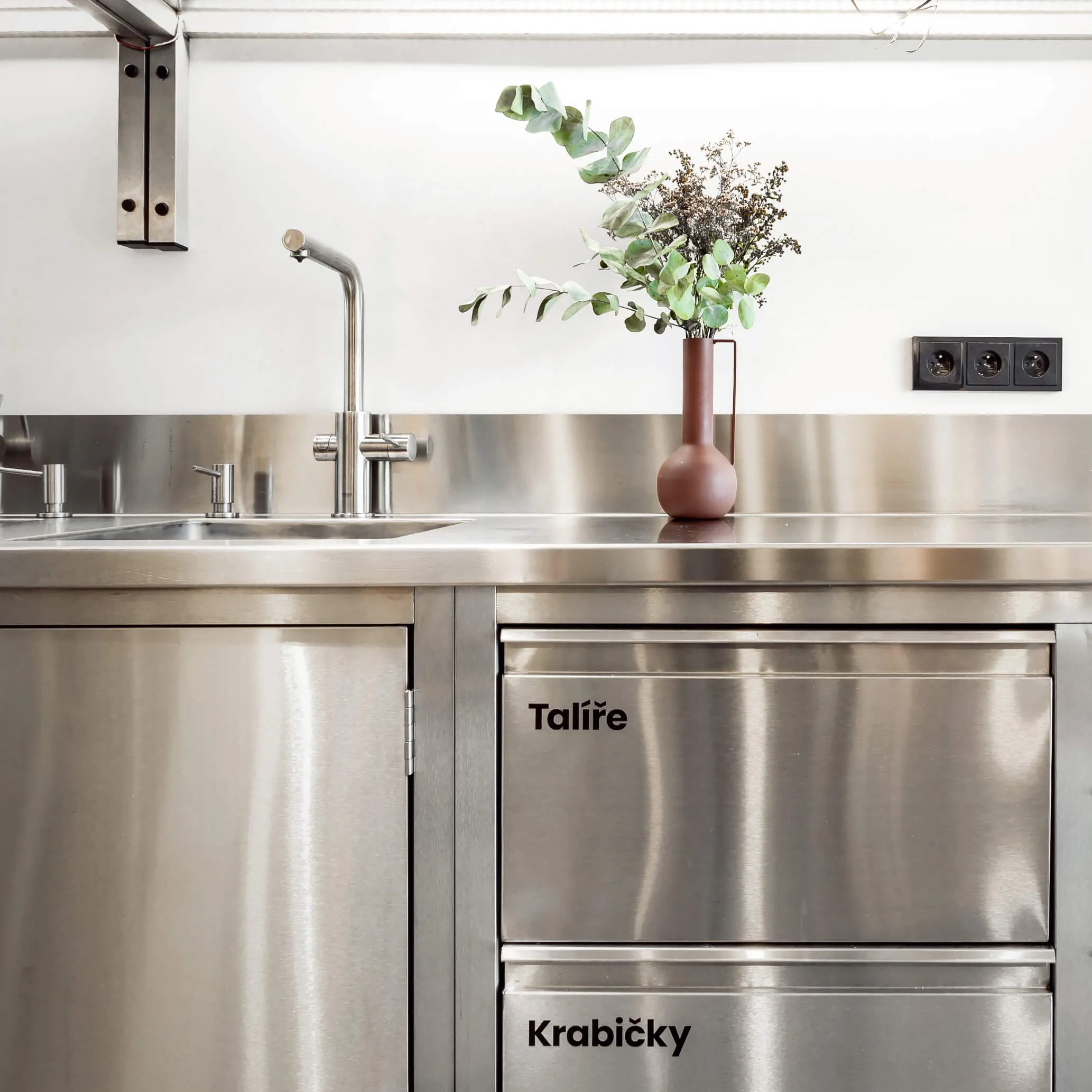
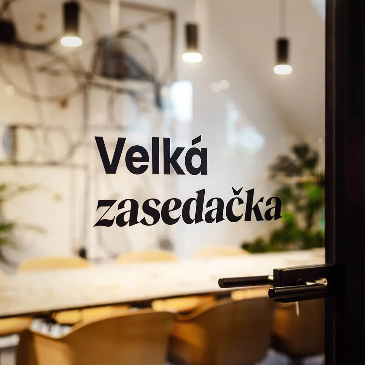
In 2022, Near & Dear underwent a significant move to a new address. The entire group occupied two floors of a Vinohrady apartment building near Náměstí Míru. To transform these new offices into the Near & Dear offices, they required care not just from the architects but also from us.
Consequently, the new identity found its way into the interiors. We collaborated with our architects to select suitable furniture, then sought out a font you'll encounter on all our doors and, for enhanced clarity, even in the kitchen.